Over the years, my mom, sisters, and I have saved wedding
invitations, save the dates, and shower invites that were our favorites.
So when it came time to create our invitation, I pulled out the
cardboard box and went through the invitations. Our wedding invitation,
once completed, had bits and pieces from many of the invitations in the
box.
The envelopes were kraft paper just like the Save
the Dates. Once again, the same ink stamps and red address labels were
used on the outside of the envelope. My mom also happened to find some
very appropriate mailing stamps; they were like vintage ads from each
state asking visitors to come visit their famous attraction.
 I am so thankful for my Aunt Linda addressing every invite; I love seeing her handwriting on them!
Each
took two stamps because of the weight and the thickness of the
invitation. We had a fun night of assembling the invites and Sara had to
use a rolling pin to flattened each one! Once opened, the invitation
was wrapped in cranberry and brown ribbon, with a kraft tag stamped with
BELIEVE.

The
long invite opened like a two fold pamphlet with a pocket in center
section. Stuffed in the center section was the ceremony invite, the
response card, and a map of the downtown Vancouver area.

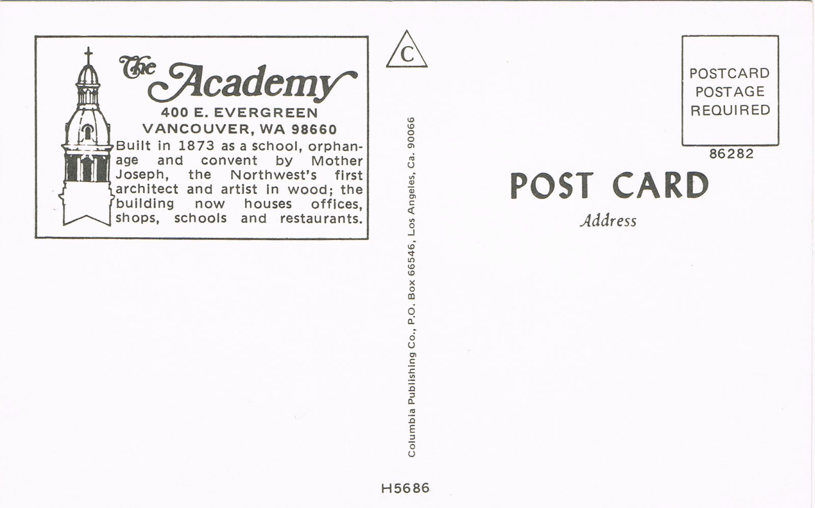
The ceremony invite, you might recognize from the
Save the Date posting. The picture is from a color postcard. We just used the front side of the postcard and turned the image to black and white.

 Our
invitation language is a bit off from the traditional language you
typically read. We wanted it to sound more like us and how we felt.
Our
invitation language is a bit off from the traditional language you
typically read. We wanted it to sound more like us and how we felt.
On
the right flap of the invitation was directions to the ceremony and the
reception. Behind it was a series of papers what we called a "Travel
Brochure."

I
picked sites around the downtown area and labeled them as dates. These
dates were places that our guests could visit while they were in town.
Places that weren't too far from the ceremony or reception, and would
highlight Vancouver.

All
of these dates were marked on the map that was included in the invite.
Like I mentioned above, the map was tucked inside the center section of
the invitation. Even how the map was folded was planned! The same night
Sara was rolling the invitations, Kelsey brought out the 7th grade
expert note folder in her and came up with how each map should be
folded. Like this:

Once
opened, it was a piece of artwork. It was after all, made by an
artist--Sara's husband Ethan. Ethan has a true gift from God, he can
paint, draw, sculpt, create, copy, and use bee's wax! I sat down with
him one night, with my laymen hand drawn example and this is what he
came up with. So nice!

As
I mentioned, also inside was the response card. The front side were
various replica vintage travel stickers. I found these, of all places,
at a discount fabric store in Portland at the cash register. As Mom and I
waited in line to check out, I looked over and couldn't believe my
luck! I thought, "Check! Response cards almost done!"
 I am not positive, but I think these replicas were exactly that, reproductions of hotel stickers that used to be in circulation.
Given that the front sticker was vintage, we turned the response card into our own vintage postcard.
 As
you can see, the red labels were used again! I just wish the post
office had better postcard stamps that I could have used. Little did I
know then, I probably could have created my own stamps on-line.
As
you can see, the red labels were used again! I just wish the post
office had better postcard stamps that I could have used. Little did I
know then, I probably could have created my own stamps on-line.
It
was fun to receive all the postcards back in the mail, as many people
wrote sweet fun notes on them. I decided I wanted to keep these notes
and fond memories around after the wedding, so I created a wall collage.
I cut around each vintage sticker and arranged them in a frame. These
now hang in our family room and I always enjoy looking at them.
 Close up of the stickers.
Hope you enjoyed the breakdown of our wedding invitation.